Creating Charts
- Click Create and select Chart as the option.
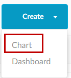
You now have three ways to create a chart.
- By selecting a domain

- By a SQL query.
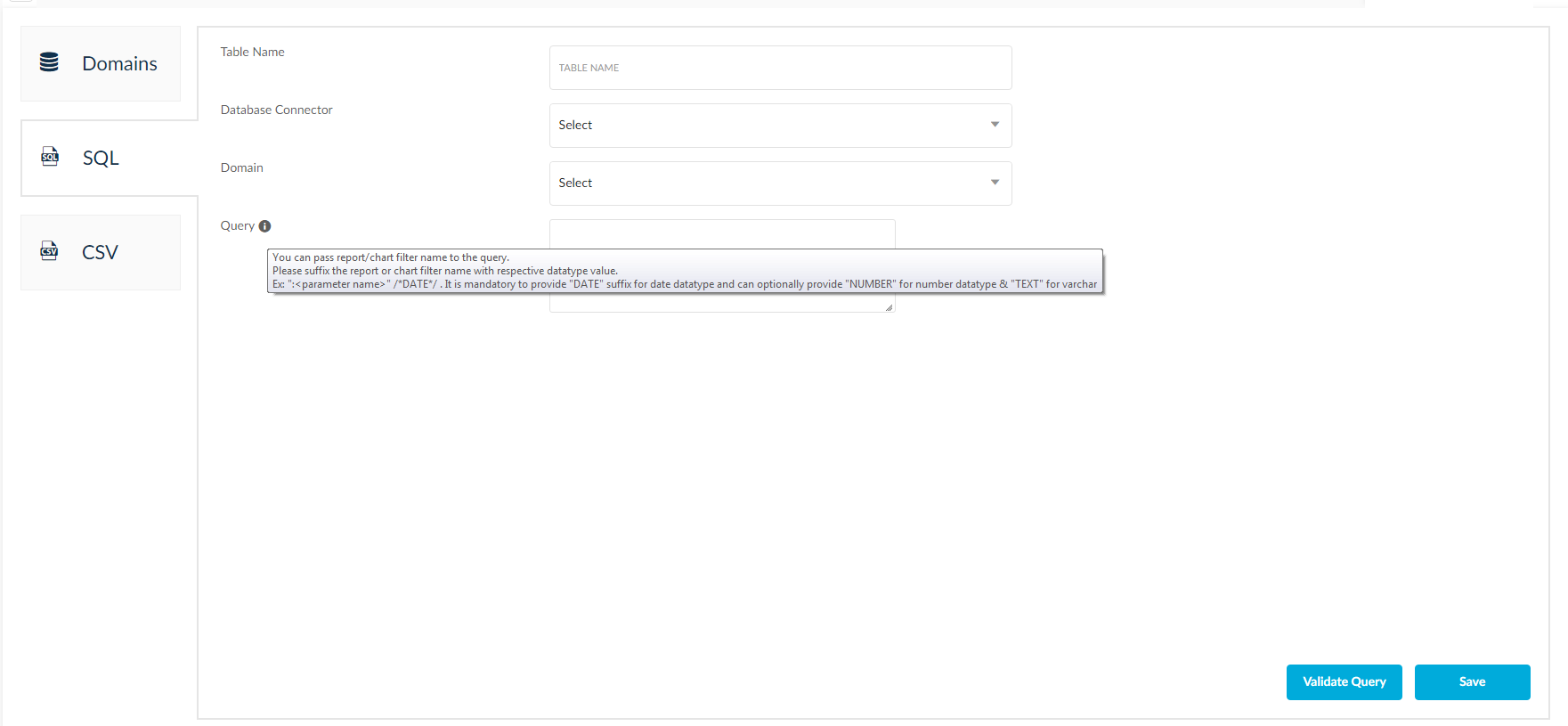
- By uploading CSV file.
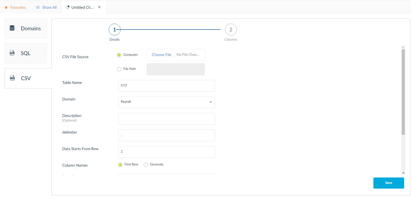
Domain Method
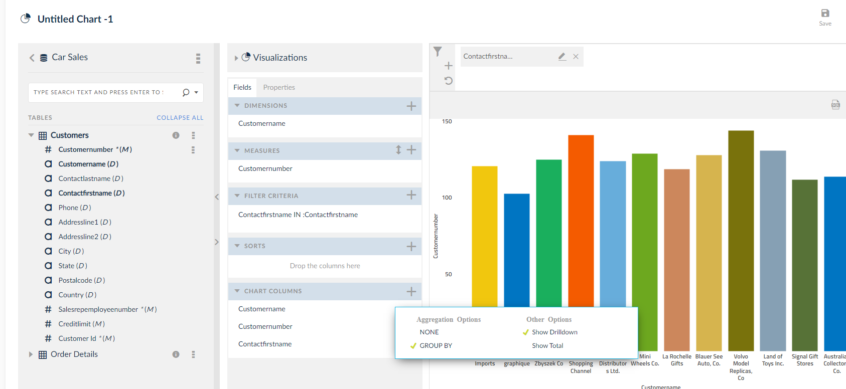
- Select the domain from the list of domains present.
- Drag and drop the selected column or double click on selected column or click the three doted icon

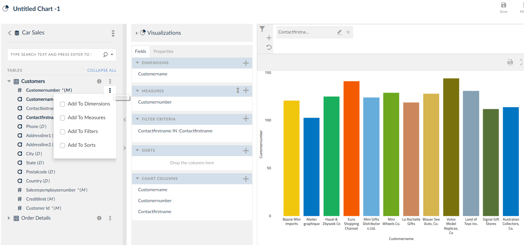
- Checking Add To Dimensions to add the selected column to the Dimensions field.
- Checking Add To Measures, Add To Filters, Add To Sorts to add the selected column to Measures, Filters and Sorts field respectively.
- Once you begin to add columns to Dimensions and Measures, a preview of the chart will be displayed immediately in the Chart Preview window. The dragged and dropped data columns visualization will be previewed in the charts panel. You can view the added filters in the filters panel. You can edit them or add new by clicking the pencil icon and plus icon respectively, learn more about them in Calculation Columns mentioned later in the topic. Filters will be discussed later in the topic thread.
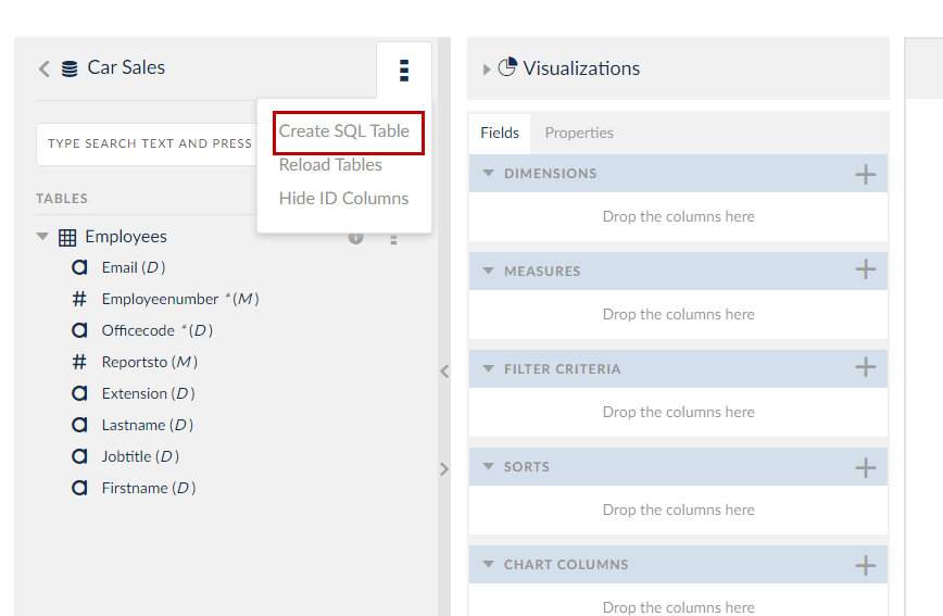
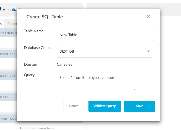
You can also create a new SQL table.
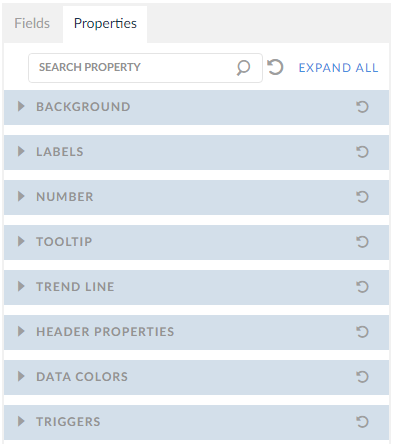
3. There are properties of the chart like Background color, Labels, Numbers, Tool Tip, Trend Line, Header Properties, Data Colors and Triggers. Each of the property will be explained later.
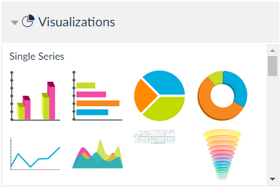
4. There are many types of charts that can be chosen from the list of visualizations available. Choose from them that aptly corresponds to your data.
5. Click Save.
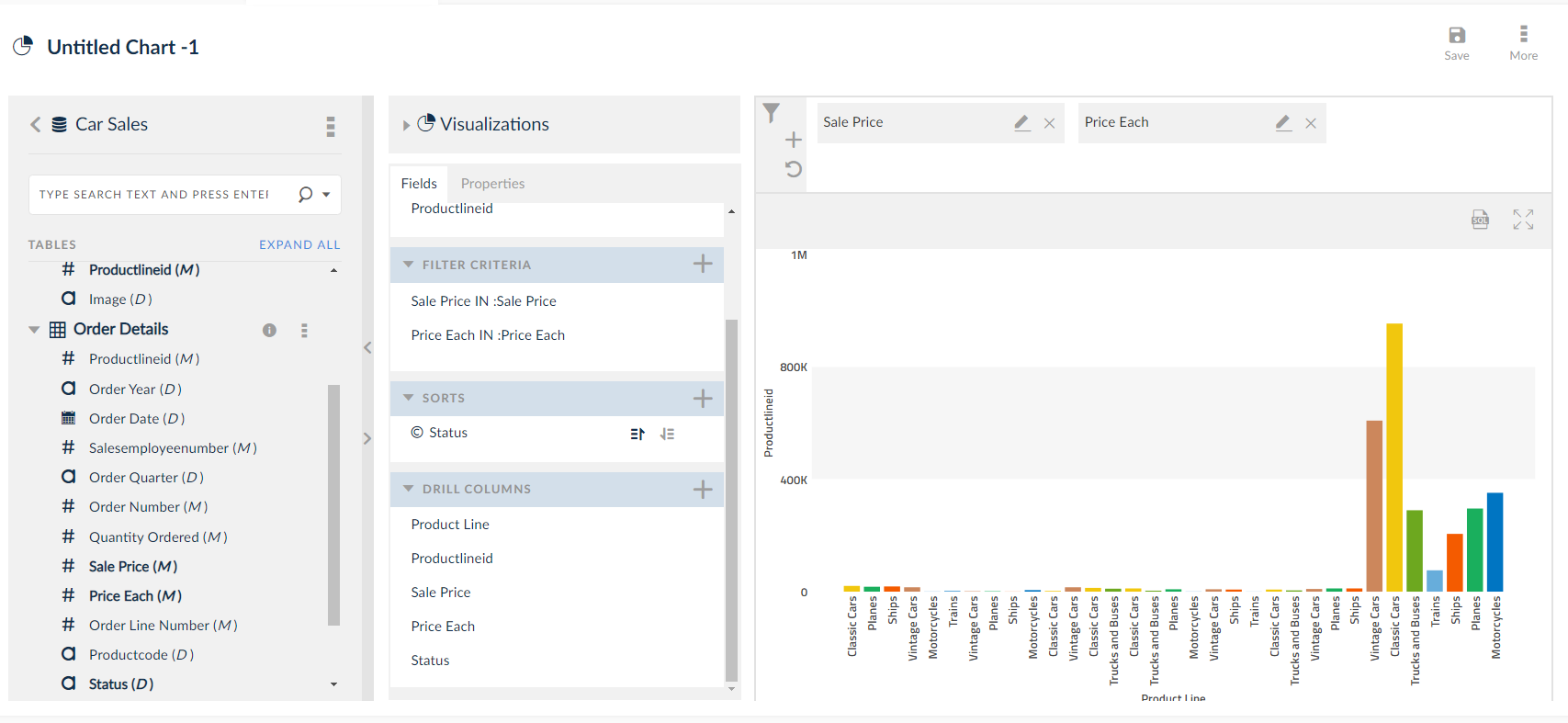
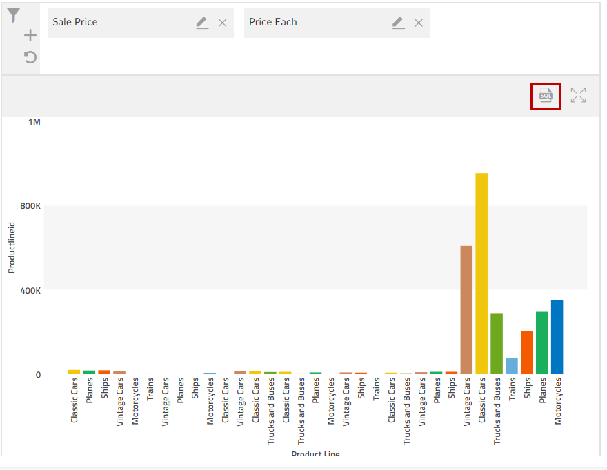
NOTE: YOu can view the SQL data of the chart by clicking the SQL icon as highlighted. View full screen by clicking ![]() icon.
icon.
Options Explained
- Dimensions Field: Columns dragged and dropped to Dimension Field are called as Dimensions. You can add multiple Dimensions to the Chart to show additional information. For example, dimensions like customer name, Employee name etc.
- Measures Field: Columns dragged and dropped to Measure Field are called as Measures. You can add multiple measures to the chart to provide additional data. For example, measures like customer number, employee number etc.
- Filters: Filter the chart data based on some condition mentioned in free text or based on selecting value from values pop up. Know more about filters here.
- Sorts: Sort the chart data in ascending order or in descending order using sorts. Know more about sorts here.
- Parameters: Parameters allow the you to specify what data is displayed on the chart, defined by the filters in place. Parameters like filters can be edited. Know more about parameters here.
- Chart Preview Window: This window provides live updates of the appearance of created chart as the user add/remove Dimensions and Measures, as well as editing Chart Properties.
- Chart Properties: Click here to know in detail about each option.
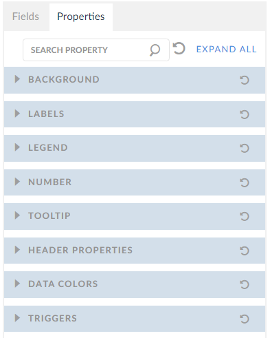
In the above image, you can find options to change the appearance of the custom chart.
- Background: Edit the background appearance of the chart.
- Labels: Edit the appearance of words and numbers on the chart.
- Number: Control the decimal output of any numbers on the chart and add a prefix or suffix.
- Tool Tip: This is a non-click function that displays information when hovering the mouse icon over a specific part of the chart.
- Data Colors: This property applies the plot colors to the charts. Choose suitable color.
- Triggers: This property controls the triggering ( before and after) mechanism.
8. Visualizations
Displays the list of chart types which depend on number of columns added to dimensions and measures filed.
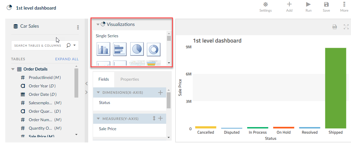
Zoom the render chart by using ![]() icon.
icon.
Preview Chart
 You can view the render chart only if Preview Chart check box is checked. Once it is unchecked, preview of chart will be disabled.
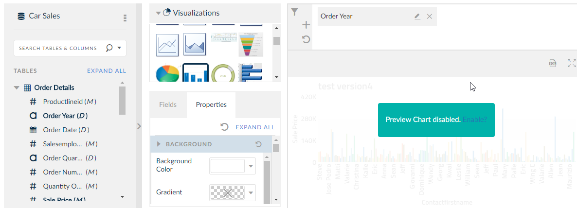
- Click on Enable and the chart will be rendered.
EBS Security
Once you select any table from the EBS domain, the following window is displayed before rendering the Chart.
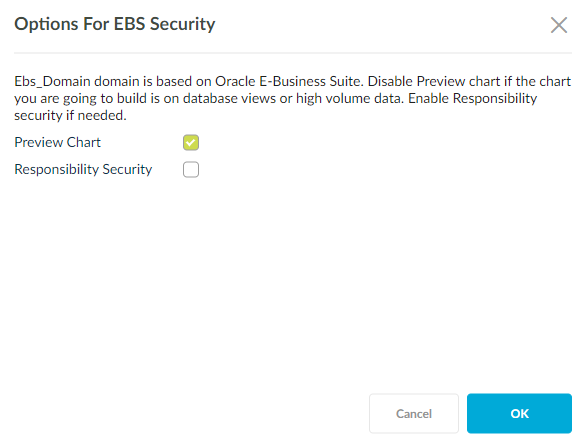
Above pop up has two options:
- Preview Chart: Checking this will enable you or the user to preview the chart in accordance to the data built.
- Responsibility Security: Enabling this option will restrict the user s without the EBS responsibility from viewing the chart.
NOTE:
- Preview chart check box will be checked by default.
- If you check the Responsibility Security check box then the Chart is considered as EBS chart else the chart will be non-EBS chart.
- If Responsibility Security check box is checked then Responsibility drop down will be displayed.
Saving Charts
Once your chart is populated with the required data, information and the customization has completed, save the chart by clicking ![]() . You will be prompted to save the chart with an individual name, along with selecting a specific Business Area and Group you wishes to add the chart to. You can also add a small description.
. You will be prompted to save the chart with an individual name, along with selecting a specific Business Area and Group you wishes to add the chart to. You can also add a small description.
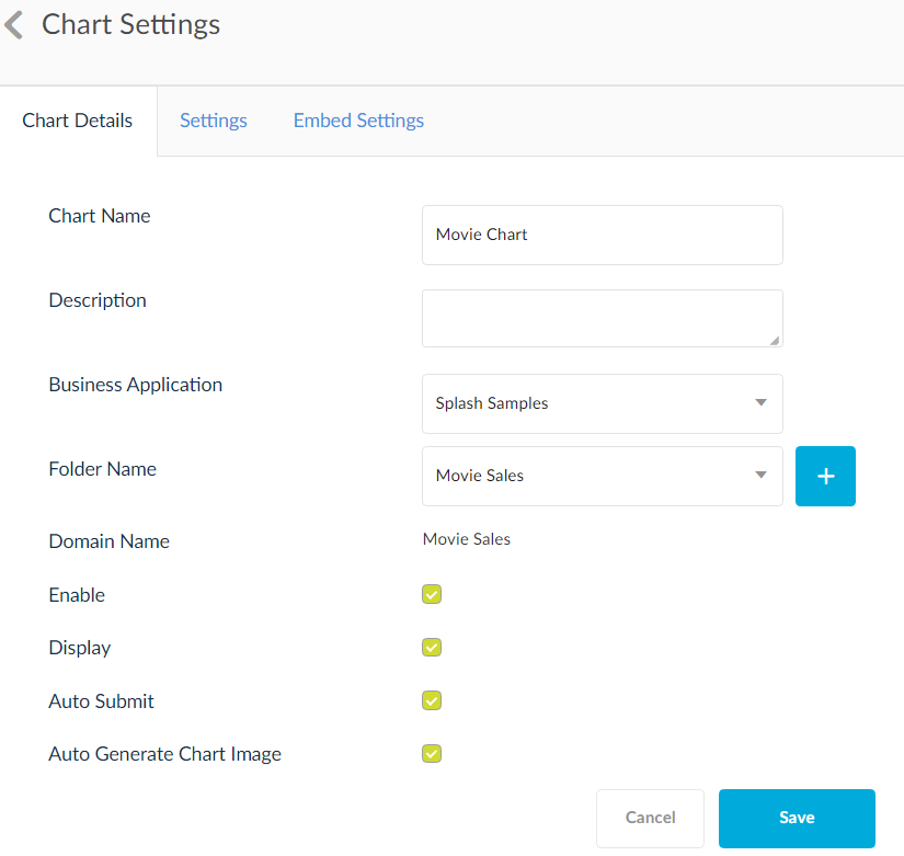
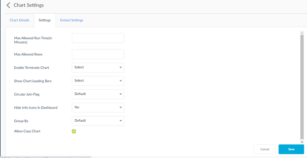
In the Settings tab, mention the maximum run time, rows and whether Terminate Chart should be enables or not.
- Max Allowed Run Time(in Minutes): Enter the maximum number of minutes you want the chart to run.
- Max Allowed Rows: Enter the maximum of rows in the chart output.
- Enable Terminate Chart: Select whether you want the enable terminate chart option visible during the run chart process.
- Show Chart Loading Bars : Set this On/Off to show/hide loaders while chart rendering.
- Circular Join Flag: Set this to On, Off or Default. Where setting default will take the admin set value.
- Hide Info Icons In Dashboard : Set this Yes/No to show/hide charts info icons in run dashboard.
- Allow Copy Chart :Owner of chart should be able to decide whether a chart should be allowed for copy or not.
- Group by Setting:Use the settings option to select group by formation in the query.Set this to On, Off or Default.
- Default : setting to default will take previous functionality.
- On: this to on to from group by based on the column group by option
- Off: set this to off to stop the group by formation in the query
When a chart is shared to a user and this user has COPY setting on , then user is able to copy the chart and then becoming owner of the chart will enable user to remove the conditions and view unwanted data.
Calculation Column
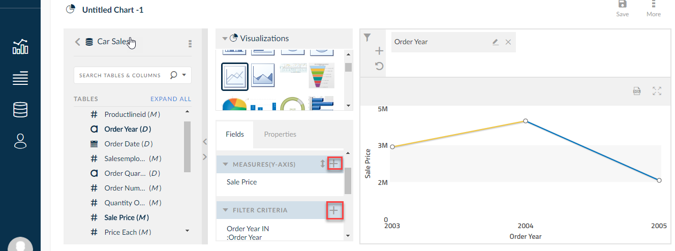
- Users can create Calculation column in Dimension field or in Measures filed using
 Create icon in Dimensions and Measures field. Once user clicks create icon the following window is displayed.
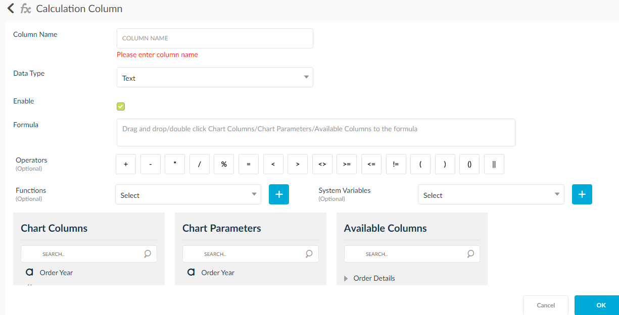
- Define Calculation column name in column name text box.
- Change the data type of Calculation column using Data Type drop down.
- Calculation column name will be displayed in Charts only when Enable check box is checked.
- Add columns from Chart Columns, Chart Parameter and Available Columns one at a time by drag and drop or double click on column name to formula text area.
- Operators are used to append operator to column name which is there in formula text area. The Functions and System Variables are used to filter values.
Top N Bottom
For example, if you want to render Top N Bottom N Chart data then Top N Bottom is used.
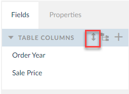
Once user clicks ![]() Top N Bottom icon the following pop up is displayed.
Top N Bottom icon the following pop up is displayed.
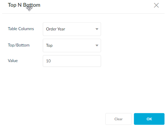
- Select measure from measures drop down.
- Access top/bottom option from top/bottom drop down.
- Selecting Top will render the chart above the mentioned values and bottom will render the chart with values below the mentioned value.
- Enter number in value text box.
- Chart will render based on the number entered in value text box.
Editing Charts
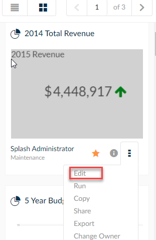
To edit a previously created chart, click for the ![]() icon on the same line of the chart and click Edit.
icon on the same line of the chart and click Edit.
List View

Grid View
After you have finished creating charts, these charts can be installed into an ad hoc dashboard to vibrantly display data at the fingertips of the end users. To learn about creating and editing dashboards, click here.